
 "Colour psychology in interior design: What actually works in your home")
Colour is often treated as a finishing touch in interior design: something chosen last, once the furniture is in place. But in reality, it is one of the first things the brain responds to. Before layout or lighting fully registers, colour begins to shape how a space feels.
This is where colour psychology enters the conversation. Widely used by designers, it explores how different shades can influence mood, behaviour and perception. But while the theory is compelling, what actually works inside a home is far more nuanced than a simple colour chart.
What colour psychology really means
At its core, colour psychology suggests that certain colours tend to evoke certain emotional responses. Blues are often associated with calm and focus, greens with balance, and warmer tones like red or orange with energy and stimulation. Designers use these associations as a starting point, not a rulebook.
As studies referenced by organisations like the American Psychological Association suggest, the way colour is experienced depends heavily on context. Lighting, texture, space and even personal memory can alter how a colour feels. A deep blue in a sunlit room may feel expansive and restful. The same shade in a darker space can feel heavy.
How colours shape different rooms
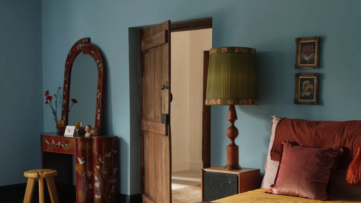
In practice, interior designers tend to think in terms of atmosphere rather than strict meanings. Bedrooms often lean towards softer, cooler tones like muted blues, greens or neutrals, because they create a sense of calm. Living spaces, where interaction and movement are higher, can accommodate warmer accents or layered palettes that feel more dynamic.
Kitchens and dining areas are where brighter colours often appear, used sparingly to add warmth or energy without overwhelming the space.
The key is balance. Rarely is a room built around a single colour; instead, it’s about how shades interact with each other and with natural light.
Why lighting matters as much as colour
One of the most overlooked aspects of colour psychology in interior design is lighting. Natural light can soften or intensify colours throughout the day, while artificial lighting can completely shift how a shade appears. A warm white bulb can make neutral walls feel creamy and inviting, while cooler lighting can sharpen tones and make spaces feel more minimal.
This is why designers often test colours at different times of day before committing. What works in a showroom may not translate the same way at home.
What actually works in real homes
Despite the popularity of colour psychology, there is no universal palette that works for everyone. Personal associations play a powerful role. A colour that feels calming to one person may feel dull or restrictive to another. Cultural context also matters — in many Indian homes, for instance, brighter colours carry warmth and familiarity rather than overstimulation.
Designers increasingly emphasise this flexibility. Rather than following strict rules, the focus is on how a space needs to function and how it should feel. Neutrals remain popular for their adaptability, but they are often layered with texture and accent colours to avoid feeling flat. Bolder shades, meanwhile, are used more intentionally as focal points rather than defaults.
Quick Reads
View AllBeyond trends
Colour trends shift quickly, but the way a space feels tends to last longer. What colour psychology offers is not a formula, but a a way to think about how interiors can support mood, routine and everyday life. When used thoughtfully, colour becomes less about aesthetics and more about experience.
 "US-Israel-Iran War Live Updates: 2 more Indian-bound oil vessels cross Hormuz as Navy warships remain on standby")
 "Qatar acquits Indian Navy veteran Purnendu Tiwary but keeps him jailed, family seeks PM Modi's help")
 "Who is Nepal’s ex-PM KP Sharma Oli, arrested over deadly crackdown on Gen-Z protests?")
 "Ukraine's worst fear confirmed: Rubio criticises Zelenskyy, backs diverting its weapons to West Asia")


