
If you are reading this on any sort of device, then you will understand how familiar and comforting the blue-yellow-red-green logo is. Most of the times, it is the first thing we see when we fire up our machines, it’s the first thing we seek out when we want to know something and at times it’s the only thing on our screens. [caption id=“attachment_2417740” align=“alignleft” width=“380”] 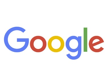 The refined Google logo. AP[/caption] Yes, we are talking about the Google logo. But even the familiar sight of the Google logo is different now, as the company refined its famous logo as part of preparations to become a part of the new holding company Alphabet. The new logo maintains the same colour scheme but the shades are of slightly different hues, and it has a new typeface called “Product Sans” that is meant to resemble the simple printing in a grade-school book. This replaces a serif typeface that Google has been using in its logo for more than 16 years. But the most striking thing is the “e’’ in the end which is slightly tilted to reflect Google's sometimes off-kilter thinking . The new logo received a mixed response on social media — with many being resistant to the change, but some actually liking the fresh look. However, the Twitterati, as expected, had a lot of tongue-in-cheek things to say about it. Here are some of the best Twitter reactions to the new Google logo:
Why is it always when the new CEO takes over a company, the first thing he/she does change the company logo?!! #GoogleLogo #WhatsTheUse
— Ayushi Srivastav (@Aa_balaNari) September 2, 2015
Hi @Google, you’ve inspired us too… #Googlelogo #SmilingE pic.twitter.com/RIuysTkdsk
— Heineken NL (@Heineken_NL) September 1, 2015
Impact Shorts
More ShortsThe new #GoogleLogo is like a mix of Kellogg's froot loops and PacMan.
— E-tard (@Etard0) September 2, 2015
Only an Indian developer will claim changing a font as real work. #GoogleLogo #sundarpichai
— Sanjay Manaktala (@smanak) September 2, 2015
I wish the new #GoogleLogo had been in Comic Sans just so I could have watched the Internet explode like the final scene in Fight Club.
— Adam Liaw (@adamliaw) September 2, 2015
However, most people seemed to be concerned about the crooked ’e’, which is the stuff of OCD nightmares:
#OCD folks, The e in the new #GoogleLogo is just for you. 🐞👾😛😄
— Srinivas (@pallikonda_s) September 2, 2015
Google fix your e. It's driving me crazy #google #googlelogo #googlerebrand #OCD
— Chris Kennedy (@ckdotphoto) September 1, 2015
lying awake thinking about the crooked "e" in the new google logo
— sam⁉️ (@SamWritesCode) September 2, 2015
 "Israel targets top Hamas leaders in Doha; Qatar, Iran condemn strike as violation of sovereignty")
 "Nepal: Oli to continue until new PM is sworn in, nation on edge as all branches of govt torched")
 "Who is CP Radhakrishnan, India's next vice-president?")
 "Israel informed US ahead of strikes on Hamas leaders in Doha, says White House")


](https://images.firstpost.com/wp-content/uploads/2015/09/Goolge-New-Logo_AP.jpg)