
 "Android 5.0 Lollipop: First look at Google's new mobile OS")
[caption id=“attachment_242210” align=“aligncenter” width=“1280”]  It always pays to be a Nexus owner, when Android updates come around. Now, Android Lollipop has arrived for the Nexus 4.[/caption] [caption id=“attachment_242209” align=“aligncenter” width=“1280”]  The look and feel of the entire OS has changed. Icons for Mail, Contacts, calculator and a lot of the native apps on the phone have been revamped. The colours are brighter and there is a slight 3D effect on some of the app buttons, like for instance contacts.[/caption] [caption id=“attachment_242208” align=“aligncenter” width=“1280”]  Notifications now look more like Google cards – black text on white backgrounds, and they have been moved to the centre of the screen for better visibility. You can also pull down and collapse notifications for more information, unlike earlier, when you had to tap on the notification to see it in its entirety.[/caption] [caption id=“attachment_242214” align=“aligncenter” width=“1280”]  Google cards are also more colourful. The titles of the cards now have banners, and when you click on them, you actually get more information than you used to.[/caption] [caption id=“attachment_242211” align=“aligncenter” width=“1280”]  A look at the camera interface. Android Lollipop also introduces the Burst mode.[/caption] [caption id=“attachment_242212” align=“aligncenter” width=“1280”]  The Music app gets some cosmetic changes.[/caption]
The first look at Android Lollipop
Advertisement
End of Article
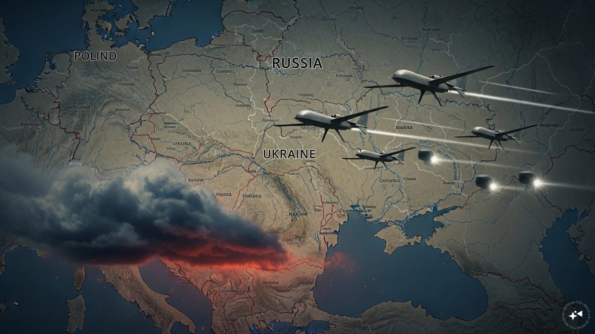 "Russian drones over Poland: Trump’s tepid reaction a wake-up call for Nato?")
 "As Russia pushes east, Ukraine faces mounting pressure to defend its heartland")
 "Why Mossad was not on board with Israel’s strike on Hamas in Qatar")
 "Turkey: Erdogan's police arrest opposition mayor Hasan Mutlu, dozens officials in corruption probe")
 "Russian drones over Poland: Trump’s tepid reaction a wake-up call for Nato?")
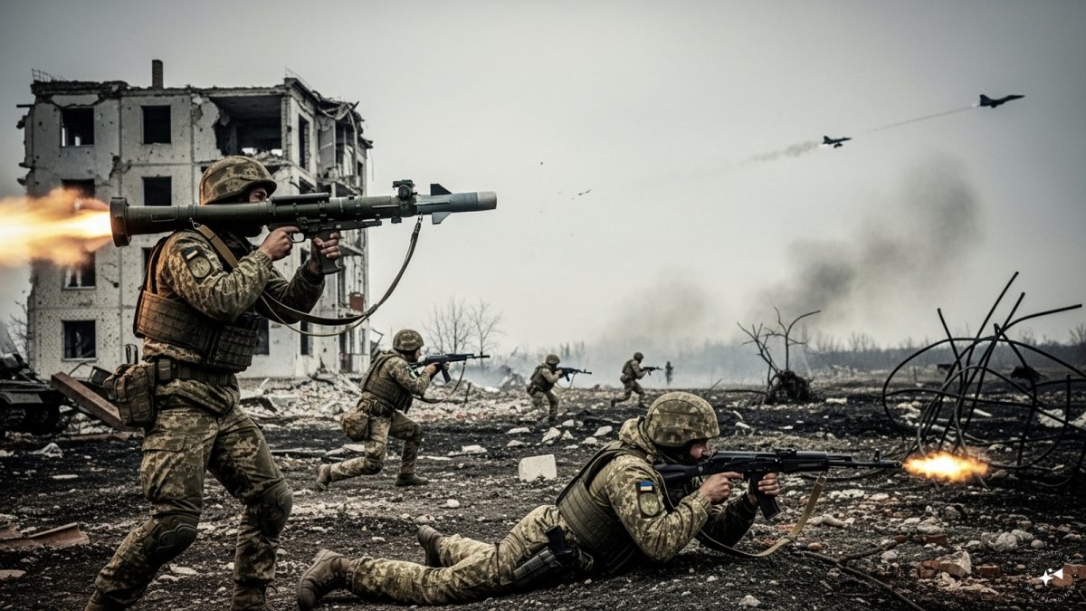 "As Russia pushes east, Ukraine faces mounting pressure to defend its heartland")
 "Why Mossad was not on board with Israel’s strike on Hamas in Qatar")
 "Turkey: Erdogan's police arrest opposition mayor Hasan Mutlu, dozens officials in corruption probe")


](http://tech.firstpost.com/wp-content/uploads/2014/11/android_lollipop_006.jpg)
](http://tech.firstpost.com/wp-content/uploads/2014/11/android_lollipop_001.jpg)
](http://tech.firstpost.com/wp-content/uploads/2014/11/android_lollipop_004.jpg)
](http://tech.firstpost.com/wp-content/uploads/2014/11/android_lollipop_002.jpg)
](http://tech.firstpost.com/wp-content/uploads/2014/11/android_lollipop_003.jpg)
](http://tech.firstpost.com/wp-content/uploads/2014/11/android_lollipop_005.jpg)