
 "Yahoo! puts old wine in new bottle with a redesigned logo")
After 30 days of teasing potential logos, Yahoo! finally seems to have settled on a brand new one. The logo was unveiled on the Internet giant’s blog post and was given a warm welcome by Marissa Mayer, Yahoo’s CEO, who also played a huge part in getting the new logo designed.
Underwhelming? You bet!
Yahoo! has been trying to reinvent itself and as its services, both on the web as well as on mobile, ever since Mayer took over the reins of the company last year. One of the most important steps for the Sunnyvale-based company, in order to re-establish itself as an Internet giant, was to go in for a quick makeover as far as its logo was concerned.
The blog post kicked off a month long activity dedicated only to redesigning the Yahoo! logo. The company made one thing very clear – the ethos of the old, familiar logo was to remain intact. Therefore, all logos during the month’s teaser activity were all purple, kept the size of the small “O” and the big “O” in the Yahoo! yodel intact and, of course, retained the exclamation mark we’ve come to associate Yahoo! with.
Mayer wrote in a blog post of her own that the company was long overdue for a change in logo – it had not been changed for 18 years. Mayer wrote that she herself was a big fan of Adobe Illustrator and decided to get into the logo redesign sojourn too. “So, one weekend this summer, I rolled up my sleeves and dove into the trenches with our logo design team: Bob Stohrer, Marc DeBartolomeis, Russ Khaydarov, and our intern Max Ma. We spent the majority of Saturday and Sunday designing the logo from start to finish, and we had a ton of fun weighing every minute detail,” she wrote.
Yahoo! expected the logo to be “whimsical, yet sophisticated”. The new logo was finally revealed last night. The font is thinner, longer and most importantly, is sans serif. No more thick, stocky logos for the company. Mayer wrote that they deliberately avoided straight lines and kept the baseline of the logo variable.
The logo redesign might seem a little underwhelming to most users who had been following the 30-day blog post. There were far too many other options that Yahoo! could have considered, and the general consensus amongst users who’ve voiced their opinions on Twitter, seems to be that the logo is a flop. Take a look.
The new logo, however, is here to stay and will be rolling out on all Yahoo! properties today.
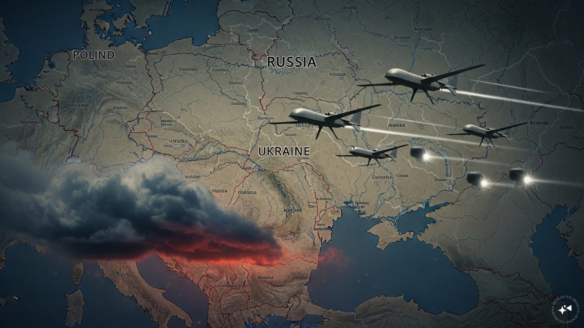 "Russian drones over Poland: Trump’s tepid reaction a wake-up call for Nato?")
 "As Russia pushes east, Ukraine faces mounting pressure to defend its heartland")
 "Why Mossad was not on board with Israel’s strike on Hamas in Qatar")
 "Turkey: Erdogan's police arrest opposition mayor Hasan Mutlu, dozens officials in corruption probe")


