 "US Elections 2012: Check out this real-time Facebook map")
As America goes to vote today, social media sites such as Facebook, Instagram, Twitter etc are also seeing a huge amount of activity. ButFacebook has gone a step ahead and created a real time map which shows how America is voting in this presidential election. You can check out the Facebook voting map here.
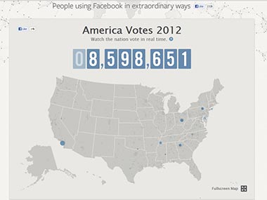
According to Facebook, the map is a representation of people on Facebook who clicked an Election Day prompt to share with their friends that they’re voting in the 2012 US election. The information displayed on Facebook Stories have been anonymized and aggregated.
Which means of course you know they voted, but don’t know who they voted for!
[caption id=“attachment_517323” align=“alignleft” width=“380”]
 The Facebook Voting Map. Screengrab.[/caption]
The cool thing about the map is that you will see a blue bubble bursting as people share the fact they’ve just voted. The size of each burst matches the number of people voting in that region. The map is definitely worth checking out as it gives a very cool macro perspective of how America is voting.
You can also click on a state and the map zooms into that particular state. The blue bubble bursts continue and the map shows you the number of statewide voters and the peak time for voting in that particular state.
Facebook has also broken down the votes polled each hour for each region of the United States on a graph just below the map. It also shows the number of male and female voters who voted and have shared their story on Facebook and has a pie-chart of the different age groups who’ve done the same.
It’s clear from the continuous activity on the map, that it’s not about voting anymore. Facebooking about votes is also a given now.