
 "Google Play Store gets a new look, inspired by Material Design")
Google has begun rolling out a new layout for the Play store on Android, and this one is also inspired by the company’s new Material Design philosophy. Google Play Store’s official Twitter handle made the announcement, confirming the redesign changes. According to a post on AnandTech, While it doesn’t look like too drastic a change where the homepage goes, navigating for an app makes it clear that the change is pretty big. The post notes that, “Google has redesigned the app pages with new animations and a new design to fit in with their new Material Design style.” The post also goes on to note that the background colour is now white (it was grey earlier). It adds, that “The positions of app screenshots and the app changelog have been moved to put better focus on the actual information on the page. Apps that have a video trailer will have it prominently displayed at the top.” The size of the apps actual photos has also increased. As for user ratings, there are different colour bars for each star-rating that an app gets, which looks like an interesting and vibrant bar graph now. Earlier Google had bought Material Design homescreens for Docs, Sheets and Slides services on the web. Where Material Design is concerned, Google had announced this new design philosophy at the I/O conference last month. According to the company, Material Design will allow developers to add shadows and seams to give visuals on a phone’s screen the appearance of depth. In essence, there’s a more animated element to apps, via Google’s material design. Elements can dynamically shrink and expand, there’s more white space between elements, and there’s an overall 3D look for apps. With the redesign of Google Play Store, ready for some more congruity on Google products with Material Design taking centre-stage.
Google has begun rolling out a new layout for the Play store on Android, and this one is also inspired by the company’s new Material Design philosophy.
Advertisement
End of Article
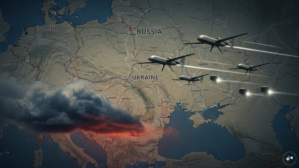 "Russian drones over Poland: Trump’s tepid reaction a wake-up call for Nato?")
 "As Russia pushes east, Ukraine faces mounting pressure to defend its heartland")
 "Why Mossad was not on board with Israel’s strike on Hamas in Qatar")
 "Turkey: Erdogan's police arrest opposition mayor Hasan Mutlu, dozens officials in corruption probe")
 "Russian drones over Poland: Trump’s tepid reaction a wake-up call for Nato?")
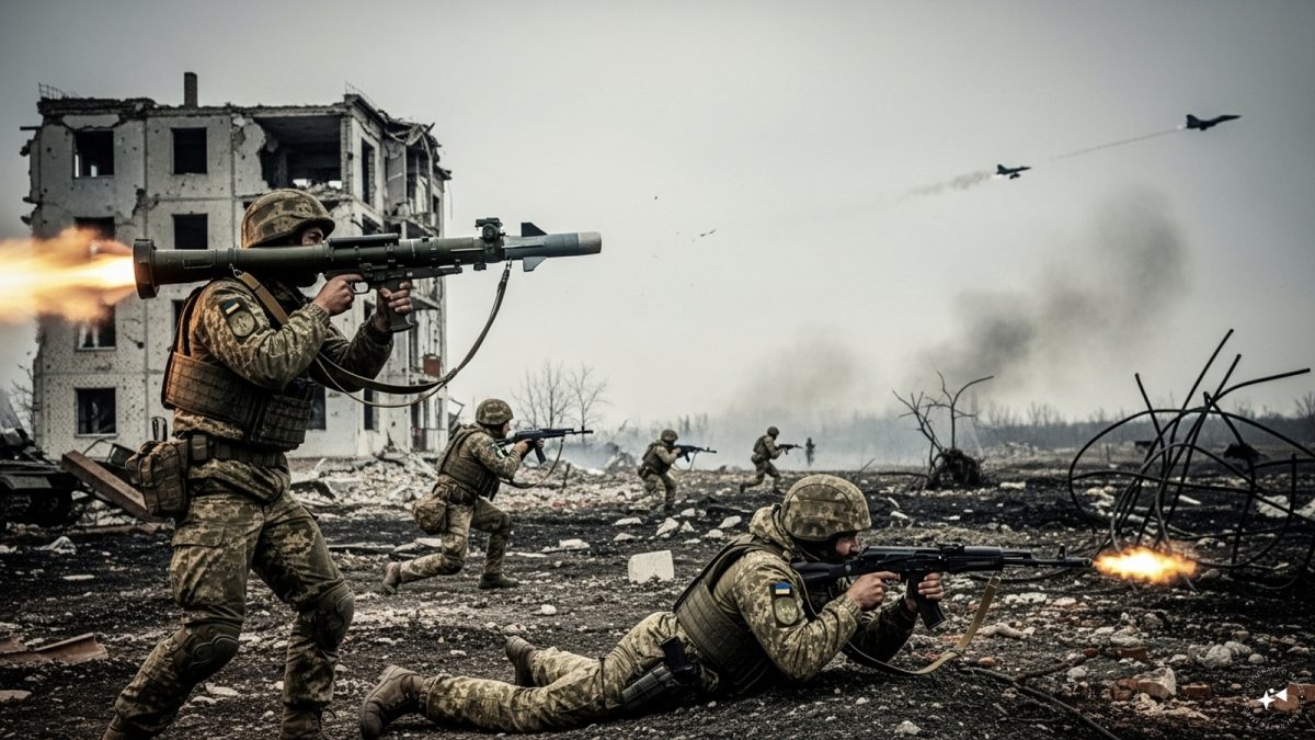 "As Russia pushes east, Ukraine faces mounting pressure to defend its heartland")
 "Why Mossad was not on board with Israel’s strike on Hamas in Qatar")
 "Turkey: Erdogan's police arrest opposition mayor Hasan Mutlu, dozens officials in corruption probe")


