
 "Is this how the Google Play Store 5.0 will look like?")
Although the Android L release is still to get an official release date, the good folks over at Android Police have already leaked out what may seem like the new interface of the Play Store 5.0. While there are some obvious visual enhancements, this is not an official update, so things may change with time. [caption id=“attachment_234458” align=“aligncenter” width=“640”]  The newer Play Store design has a more flatter design approach with vibrant colours[/caption] The front page of the Google Play Store sees some changes, you have a larger Play Store header with the individual sections beneath it. The immediate change you will notice is the use of flat design elements, keeping it in line with the Material Design philosophy. You also get more vibrant colours. [caption id=“attachment_234459” align=“aligncenter” width=“640”]  Comparing the changes. The new changes are on the right[/caption] Each individual category has a significantly large banner along with the sections such as Home, Top Paid, Top Free and so on. A lot of the pages on the Play Store are getting more colour or background images instead of having a plain white background - to add to the visual appeal. [caption id=“attachment_234456” align=“aligncenter” width=“693”]  Changes in the Play Store 5.0 on the right hand side[/caption] Some of the promotional pages which just had text-based information, now have background images and a lot of colour. One of the most notable examples is seen above with the Antenna Sampler. Inside the Play Store APK, there are five ic_launcher files besides the revised Play Store icon, which has also been revised. Each of the icon corresponds to the individual Play Store categories such as apps, movies, newsstand and so on.
Although the Android L release is still to get an official release date, the good folks over at Android Police have already leaked out what may seem like the new interface of the Play Store 5.0. While there are some obvious visual enhancements, this is not an official update, so things may change with time. [caption id=“attachment_234458” align=“aligncenter” width=“640”]  The newer Play Store design has a more flatter design approach with vibrant colours[/caption] The front page of the Google Play Store sees some changes, you have a larger Play Store header with the individual sections beneath it.
Advertisement
End of Article
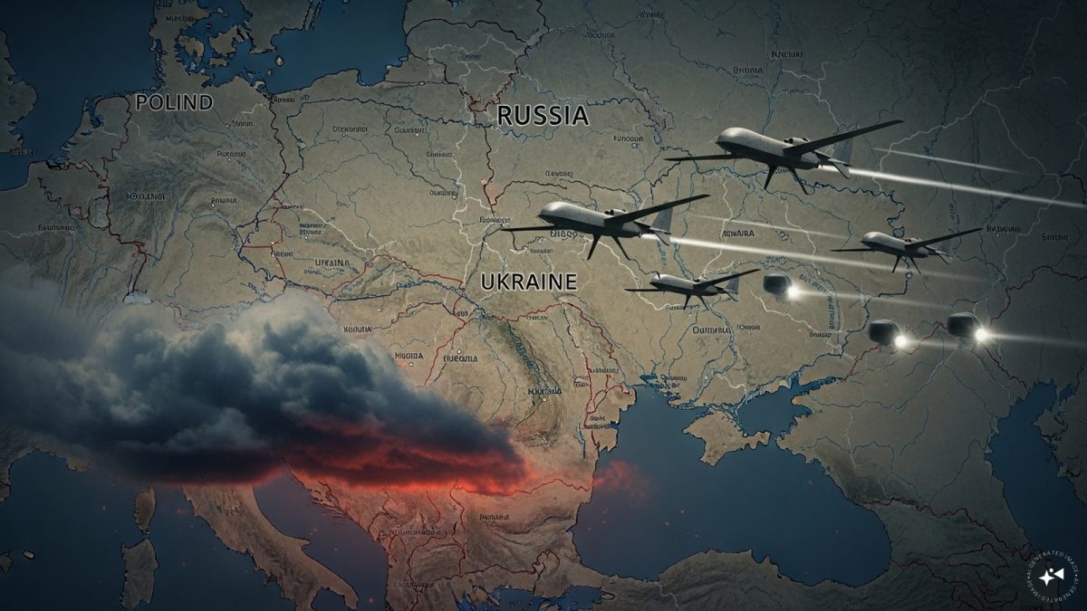 "Russian drones over Poland: Trump’s tepid reaction a wake-up call for Nato?")
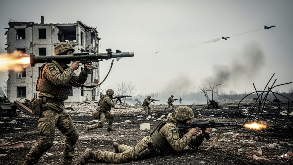
 "As Russia pushes east, Ukraine faces mounting pressure to defend its heartland")
 "Why Mossad was not on board with Israel’s strike on Hamas in Qatar")
 "Turkey: Erdogan's police arrest opposition mayor Hasan Mutlu, dozens officials in corruption probe")
 "Russian drones over Poland: Trump’s tepid reaction a wake-up call for Nato?")
 "As Russia pushes east, Ukraine faces mounting pressure to defend its heartland")
 "Why Mossad was not on board with Israel’s strike on Hamas in Qatar")
 "Turkey: Erdogan's police arrest opposition mayor Hasan Mutlu, dozens officials in corruption probe")


](http://tech.firstpost.com/wp-content/uploads/2014/09/nexus2cee_wm_c.png)
](http://tech.firstpost.com/wp-content/uploads/2014/09/compare.jpg)
](http://tech.firstpost.com/wp-content/uploads/2014/09/Capture3.jpg)