
 "Google may opt for a flatter looking logo after all")
It’s the season for new logos. While Yahoo! unveiled its new logo recently with much fanfare, Google seems to be on its way to revamping its old, colourful one.
This new, flat logo was found by Ars Technica last week in a beta build of Chrome for Android. While the new look of the logo caused excited ripples in the tech community, sources told The Verge that Google was designing this logo for simplified branding. The flat looking logo would appear on places where the beveled version looks off – like printed banners and letterheads.
See the difference? (Image credit: Ars Technica)
However, there seems to be a lot more to the logo change than meets the eye. According to The Verge, the flattened out logo has been appearing to certain users when they log on to the home page of the website now. In fact, high resolution images of the branding can be found even on Google’s servers, along with the current logo.
This fact doesn’t gel too well with Google’s explanations that the new, flat logo will appear only in places with low visibility. With the new Google banner being visible on the website and other places, something seems up with the company. Even while it isn’t exactly a major change like Yahoo’s, a flatter Google logo will mean that the company seems to be wanting to keep up with times.
Google, on its side, said in a statement that it was constantly running experiments in the look and functionality of search and it included toying with the logo too. The first step by Google was to admit something was cooking as far as the logo was concerned and that has been done. Announcement about the wider rollout of the logo is what we’re expecting next.
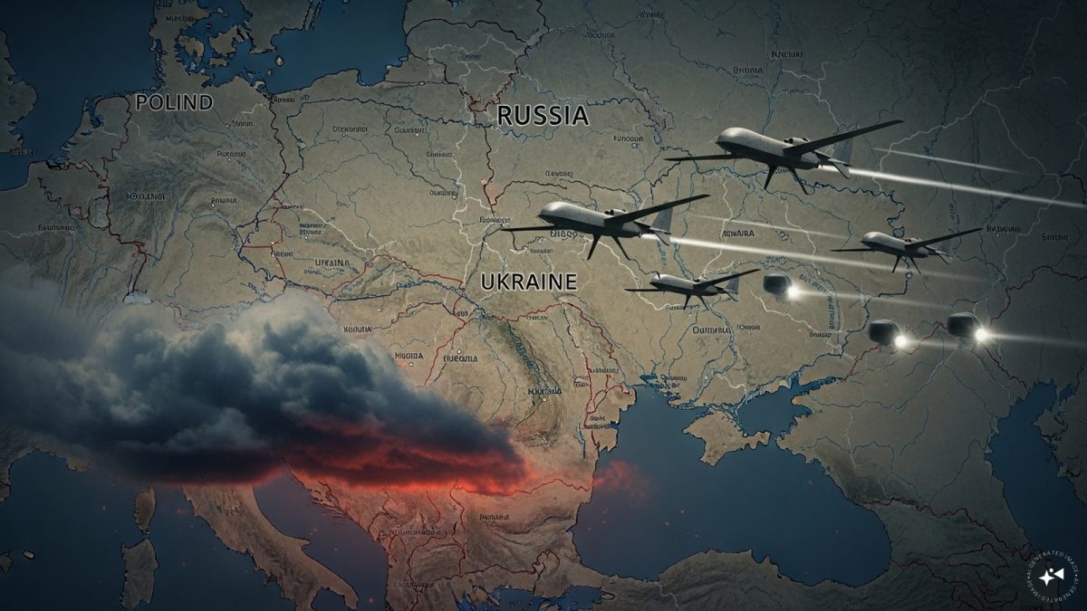 "Russian drones over Poland: Trump’s tepid reaction a wake-up call for Nato?")
 "As Russia pushes east, Ukraine faces mounting pressure to defend its heartland")
 "Why Mossad was not on board with Israel’s strike on Hamas in Qatar")
 "Turkey: Erdogan's police arrest opposition mayor Hasan Mutlu, dozens officials in corruption probe")
 "Russian drones over Poland: Trump’s tepid reaction a wake-up call for Nato?")
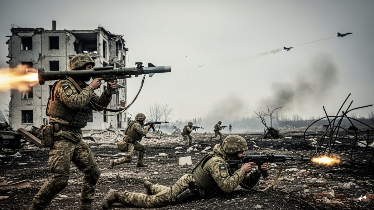 "As Russia pushes east, Ukraine faces mounting pressure to defend its heartland")
 "Why Mossad was not on board with Israel’s strike on Hamas in Qatar")
 "Turkey: Erdogan's police arrest opposition mayor Hasan Mutlu, dozens officials in corruption probe")


